Angelgaze
Demo post-mortem (lessons learned)
 The objectives behind the development of the demo were:
1. to verify if I even have the art skills to pull something like this off. The time involved is staggering, and I don't feel like working on something that ends up being crappy
2. to verify that the medium (point and click adventure) can really tell this story without turning it into something goofy. I came up with the story first (initially it was going to be a book, I might post the first few pages at some point)
3. to verify the exact time involved per screen and calculate the total development time, so I can decide whether it's worth it or not
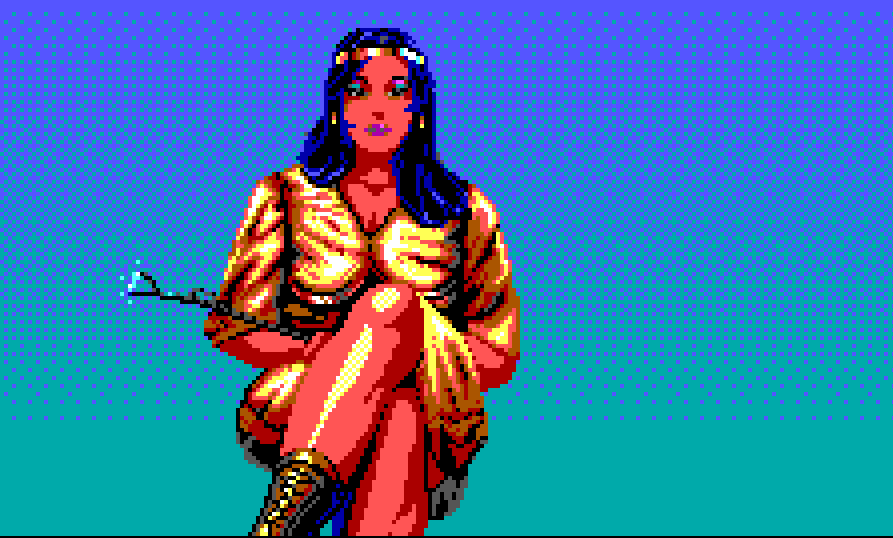
4. can 320x200 be "sexy"? I never intended for this game to be scandalous, I think if anything it would detract from the story - but I want attractive female warriors of some kind to be part of the plot. Oh and it's really 320x134 during normal gameplay
5. only at the very last place is there any concern about seeing "how much the thing sells" I am expecting this to be the most expensive form of entertainment for me, i.e. work like a dog and get zero in return. I mean, point and click... EGA??? yeah no.
Well, several months (?) later the conclusions are as follows.
- I learned that even though my art skills are not excellent, my superpower of "finding flaws" in things will carry me through, so as long as I'm willing to keep revising until I'm satisfied. It is a painful process. I think you have to nail level of detail just right. There are many sierra backgrounds that look better than some of mine and they are clearly far simpler.
- It seems as if the medium would NOT really suitable to tell the story at all, but using tons of blues, huge portrait animations for when the characters are talking, and the VHS effect and 80s references sort of fixes that, and creates an overall believable theme and mood that I'm sort of happy with
- For the sexiness part it seems as if there's no screen estate to get enough detail for a full body shot. You can have a good portrait, or a good lower body but not both in the same screen (or at least without lots of difficulty). I will have to find a way to allow the character to observe different spots (maybe becomes a part of the game mechanics). I did get farther with this than I thought I would honestly, especially given there are only 2 skin tones in EGA and they're both freaking RED. But hey I also tried to change that to pink and mess with the palette, and... it looks worse? I don't think I can be unbiased about this, too used to this particular palette, and now I've been staring at it for months so...
- the part that totally didn't pan out is the time measurement. There were too many experiments to carry out, too many glitches with Unity to figure out, etc. etc. I think a good estimate for measuring time will come in the next few screens developed after the demo
LESSONS LEARNED
I learned the following lessons that I will rely on as I continue to make this game.
- Sense of depth and proportions will take the place of shading with a small palette. It is pivotal to try a rough line drawing of your room and get the character to walk inside it, to get a feel for whether it's worth continuing with that composition or not. It's good to have a clear direction for the light source, and get creative with it like lamps, LED lights, whatever can increase the perceived detail. If this is done right the weird and limited palette can become a plus, in the sense that it takes you to that "sort of real sort of not real" liminal space where you are exploring a different world instead of a digitized version of reality
- It is actually very difficult to do dialog. It is as difficult as writing dialog for a movie. Either you show the character as a small sprite, in which case body movements have to be exaggerated like theater acting, or you rely on the huge portrait talking animation, in which case any extra expression variation is another asset to produce (and the pixels are big so it's not as if you have total freedom to portray any expression). I found that it's very easy to just write something that tells the story but very hard to make it convey a mood particularly in a tree dialog. Pacing is important, revealing things slowly through foreshadowing is important, at the risk of not being sure in the end "does the player even catch this?" But I decided to accept this compromise. I'd rather have dialogs I am satisfied with, and have many people miss a couple of references, I guess it makes for some replayability (after you know the full story you would in fact catch the references). Well, so in the end I am changing the dialogs all the time and in many spots I am still pretty dissatisfied with what I have, so in the final release the 'demo' dialogs may also change. For now they are very linear, in reality they should be more interactive with new options opening up etc.
- No room is ever "finished"... a story is not linear, past and present events are intertwined... every room you add there's something in the past that you need to change (add a foreshadowing, remove some revelation which is best saved for later, etc).
That's long enough, does anyone even read this. More a la carte thoughts later
Comments
Log in with itch.io to leave a comment.
This project is crazy good, dude. The part with the meteor shooting by... the dialogue was simple and created a strong atmosphere - you have something here. Please continue it. Others will find you. Your art style really captures Sierra, and the colour usage is good.
Thanks. If I can only complete one of the two which one is more promising (the other one I just uploaded yesterday)
Angel Gaze for sure.