Angelgaze
What I don't like about the demo
 The main thing that's pissing me off is how much worse screens look that aren't based on blue and red.
As soon as the character arrives upstairs, the bright white room is like a punch in the eye. The brown rooms, generally I don't like despite how much time I put in them. Lobby, elevator interior, upstairs corridor, and Kian's apartment. Also the dream planet, I iterated all possible color combinations and there was nothing really suitable that wasn't going back to just blue and black.
The only rooms that are non-blue and to my satisfaction are the cafeteria, Crowe's office and the beach (which is not in the demo but there's a screenshot on the itch game page). If you are wondering why there are things in the screenshots that aren't in the demo, well, I had to answer the question "what would different settings look like with this palette". But those are environments that come later on (including the bathing women, sorry guys)...
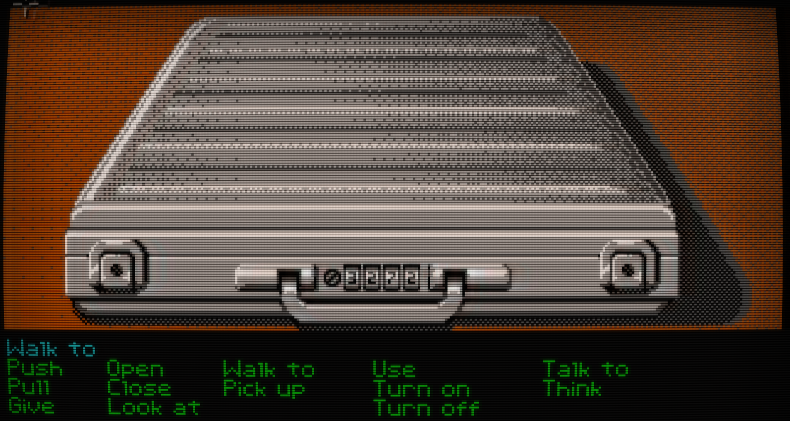
In the suitcase above I think I overdid the dithering a tiny bit. I'm still getting my feel for what works and what doesn't...
Other minor pet peeves:
- I like the scanlines but if they are strong enough you get moire, if you make them weaker moire goes away but now you can't see them very well anymore. Also something to do with curvature, couldn't find a better combo so for now ALT-W lets the player change between strong and weak scan lines
- I wanted to have only adlib/OPL chip synth tunes or even just use the retro PC speaker simulator (https://www.kvraudio.com/forum/viewtopic.php?t=487565) but it ended up being a mixture of retro OPL tunes cause I'm prioritizing the mood over all else. It may be possible to 'translate' the music into OPL and maintain the mood but it's a lot of work. I may still have some PC speaker rooms here and there if I find a plausible reason for some locations sounding different
- animations could use a couple more frames, that said this is the part where being on low palette plays to your advantage. You'd never get away with just one frame of the character's hand raised to push a button, but here because it's all so stylized, it's not totally out of place.
- it's not perfect pixel art, the horizontal scrolling (parallax) is sub-pixel. The characters move horizontally on a sub-pixel basis. It's bugging me but enforcing exact pixels makes the movement look like crap so for now this is just how it is.
Comments
Log in with itch.io to leave a comment.
Started playing the demo this morning and am loving it so far. I really hope you are able to finish the game one day. I'd love the ability to completely turn off the filters and view the pixels in their raw glory. I'm probably in the minority here, but I actually like how old EGA graphics look on modern LCDs without shader magic.
You can do it. ALT-S in game removes my side of the effects. HOME key takes you to reshade, where you can switch off the 3 effects with their checkbox. Voila raw pixels
Awesome! I checked it out and the games looks lovely without the filters and effects. I wish you the best as development progresses and I look forward to the final release one day :)
Thanks a lot! You can help make the release possible by spreading the word