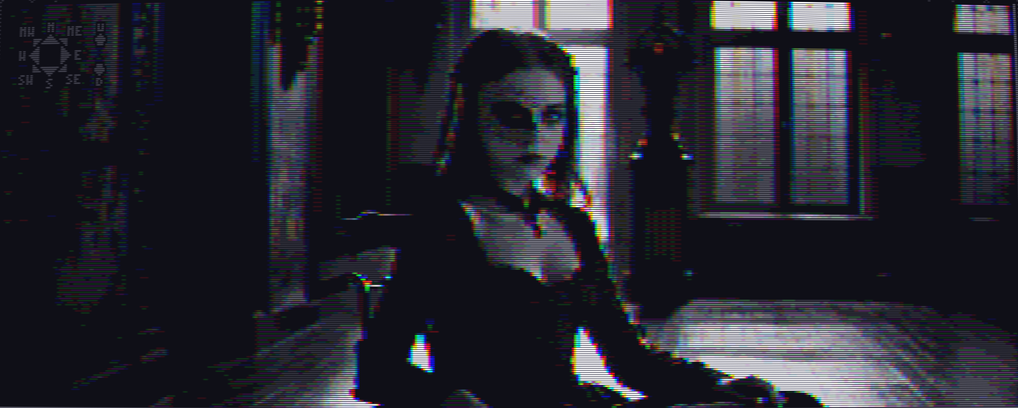
Why the UI is not color-fringed
Hazel » Devlog
This look is based on the Amiga HAM color mode which produced color fringing. The UI does not have the effect, and also it's at a different resolution. I think that's ok because it imitates the "discrepancy" in look between UI and the photoreal content that we saw in FMV games like 7th guest, phantasmagoria and so forth. Also if I apply the effect to text it becomes VERY hard to read.
Conversely "no effect anywhere" looks cheap and doesn't take you into the "surreal" retro space.
What do you think?
Get Hazel
Hazel
INTJ female succubus meets catholic boy obsessed with psychoanalysis (Bram Stoker's Dracula but role-swapped)
More posts
- More bug fixesMay 28, 2025
- Please redownloadMay 20, 2025
- Updated version is upMay 19, 2025
- Slowly making progressJun 24, 2024
- "No body" bugfixJun 02, 2024
- "it", "him", "her"May 21, 2024
- New version uploadedMay 20, 2024
- Some comments I receivedMay 20, 2024
- Bugfix if it hangs when you ring the pharmacy bellMay 18, 2024

Leave a comment
Log in with itch.io to leave a comment.