Hazel
Some comments I received
Summarizing a few topics, as well as my thoughts, from an extensive game analysis by a user named M.
I very much appreciated him taking the time to send this. With most points I am either in agreement, or I totally see why one would have a certain impression given what you see in the demo. Even when I push back a little it's still hugely enlightening to get such feedback as I've been staring at this stuff for months and in a way I've become blind to it. So thanks a million!
Let's dive into it...
------------------
- It was not clear that SEARCH is different from EXAMINE.
In text adventures, I remember that whenever you want to find items hidden inside other items usually you search, whereas examining just reveals the outer appearances of a thing. Obviously this is subjective and if the game goes anywhere there will be tons of people playing it who did not play lots of text adventures (or not the ones I played). So I think perhaps some nudging could be inserted the first time there is a need to SEARCH so that the way this command is used will be subsequently clear to the player. I will revise the response to "examine" (the thing you are talking about, no spoilers!) so that it does indeed suggest searching, so that it's clear going forward.
- When the parser asks for disambiguation ("Do you mean the book on the shelf or the book on the counter") it does not remember what you just said, so you can't just reply with "shelf" or "counter" you have to start over and type the full "Look at the book on the shelf"
Absolutely - will add this going forward. It was not a design choice to omit it.
- You can take the books multiple times from the shelves
Fixed it for the next upload now, thanks for reporting!
- "It was a little unexpected that I had to return an item to its original location to drop it. I guess this was done to keep the object images cohesive with the location. It wasn’t a big deal given the scope of movement in the book store, but potentially it might become a problem later in the game if the same restrictions are applied to larger locations."
Interestingly Abraxas just yesterday said he liked the idea of having to return an object to the original place. I was surprised by that comment but not yours - in real life one can put things down wherever one pleases (at least in your own dwelling). He did not catch that the only reason for it was that this way one object only needs one position and graphical overlay, a point on which you are totally right :)
This consideration is the most important - otherwise there is an impossible number of permutations of graphical assets required. But, the game has to be structured in such a way that it still makes sense - for ex. leaving the can in the bathroom every time makes sense. Umbrella, almost sort of if he's a very tidy person that has a place for things. With smaller objects, for now I'm just forcing the player to keep them. So I agree that if totally misused this could become an issue later. Generally it's not a game where you are going to be doing a lot of "dropping", it will remove inventory as you get through sections. But I agree with your assessment that it's a bit of a deviation from text-only adventures and it can be unexpected the first time.
- I wasn’t entirely sure whether your intention was to require seeing objects in the graphic display as part of the puzzle solving. I think the plants are never mentioned by description,
No it was not my intention (unless it's a special case of a close-up of something where the puzzle is clearly visual), Unless I think of an exception like that for later on, I think one should be able to play this as a text game with graphics being just for mood. Keeping with that, I added a mention of the plants, which I had missed.
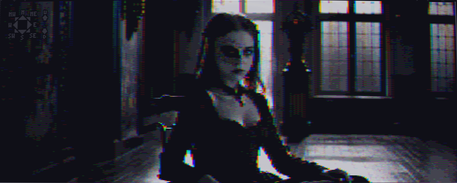
- "Given the tone of the story and style of the images, I think the fringing on the main graphical display actually works very well, but the use of fringing on UI elements felt out of place. It seems that text boxes appearing on top of location graphics, as well as the image of the player character on the right, do have fringing, but the other UI elements do not"
The reason the character is fringed is that it's a photograph. I want to keep everything that is photorealistic fringed. It is true that the "box" with the text is fringed when it doesn't have to be - I tried not fringing it and it stood out a bit too much with the background. The compromise of fringing the outline but not the text was the best in my opinion, so this is a design choice, but I noticed sometimes the fringing nukes one of the lines and that's excessive... so I might revise this later. I do see how mixing fringed and unfringed could elicit very different takes from people ... some are saying ALL text needs to be fringed as well (but then it wouldn't be legible). Hopefully at some point the story takes over and this becomes less distracting.
What I really hate is that godot gives you no way of calculating the length of a string that wraps... so you will see the outline of the text get resized as it's printing, that to me is a lot bigger problem and I haven't found a solution yet.
- I also felt that the UI itself was a little dark and hard to read, and didn’t necessarily have to be grayscale. My gut feeling is that it might be better to treat the UI in a way more similar to older Amiga CD-ROM titles, where there is a clear distinction between the UI “frame” which has its own colour palette,
Not sure about contrast, wonder if other people think so? The background is very dark for the text, and the font is near white...
About the colored UI, my thinking it that it's supposed to read like an old book, so the black and white aspect is pretty fundamental. If I put a colored outline it would lose that. At the same time it _would_ I think give it a more "amiga game" feeling, so your point is not lost on me. Fortunately this is a very easy point to just add a "switching" option at the end.
- There seems to be something fundamentally wrong with the way the cursor position is being calculated, possibly related to how the window is sized.
Oh yes, it's messed up in window mode. I will look into it, thanks!
- Within the scope of the demo I didn’t feel that the presence of “think” as an action was justified, and potentially the same information could have been conveyed more directly. If it becomes a more important mechanic in a later part of the game, the way it was used in the demo is potentially not preparing the player for that.
Agreed. It will indeed become more important later, the demo does not contain parts where thinking is strictly necessary. It's just there to add a bit more context if one wants to dig in. Confession: the "demo" was not planned in any way! At some point I just said screw it and uploaded what I had :)
- There were also a few parts of the game that I thought where a mechanically confusing, such as indicating the presence of another character with an icon in the left side of the interface. If your intention was to have the game actually playable as a text adventure this indicator may be redundant, and in the case of the bird appearing at the window, I found it confusing that the icon appeared. Retrospectively it makes sense, since the player character knows the bird, but if the intention of the icon is to prompt the player that something has changed in the scene, I’m not sure that is the best way to do it (and incompatible with playing the game in text-only mode, if that is a consideration).
The UI philosophy is to give a big photo in the center and arrange all "knowledge" details around it. Example, what the player currently looks like, what he's carrying, what he's wearing etc. - seems to me that "who else is in the room" (people or creatures) is a legitimate panel to add (also I had the space lol). Also because it's a "social" game in which everything that happens is between people. And finally a big part of it is that due to the graphics style people won't really stand out when they are present but rather blur into the background. The employee at the station is a good example of it.
Now I do notice now that in some cases the printing of text listing the people in the room is suppressed - that shouldn't be the case, I agree with making sure that the text can stand on its own so I will look into that. Hopefully after that is arranged having an added visual representation of it has no downsides.
- This did leave me a little unclear about whether the game would have multiple endings or be required to be replayed in order to get the single “true ending”. I imagine fans of visual novels will like branching and stats, but I’m not sure that fans of interactive fiction would be as accommodating, partly because the mechanics of replaying the game by operating the text parser would be very different to rolling through dialogue options with the mouse
I plan to have multiple endings but no substantial choices throughout the game, it would make the game much more expansive without in my view a commensurate benefit.
- Perhaps the only comment I can make here is that, I accidentally increased two of the vice stats when (in my mind) I was choosing options to present myself as a strong character to Flora, but it seems I may have actually been having the opposite effect
Hehe, yes - don't try to game Flora, you have to be pious not alpha! :D
------
Very grateful for these comments and if anyone else wants to chime in I'm sure it will be even more interesting. I never released a game so going from 100% the idea in my head (which as I said I stared at for so long that I've developed a blindness to it) to now hearing how others see the same features and sometimes glitches, is very instructive indeed!
Files
Get Hazel
Hazel
INTJ female succubus meets catholic boy obsessed with psychoanalysis (Bram Stoker's Dracula but role-swapped)
More posts
- More bug fixesMay 28, 2025
- Please redownloadMay 20, 2025
- Updated version is upMay 19, 2025
- Slowly making progressJun 24, 2024
- "No body" bugfixJun 02, 2024
- "it", "him", "her"May 21, 2024
- New version uploadedMay 20, 2024
- Bugfix if it hangs when you ring the pharmacy bellMay 18, 2024
- Why the UI is not color-fringedMay 18, 2024
Leave a comment
Log in with itch.io to leave a comment.